Never mind the Mobile Web; Here’s the Device Web (Dino Esposito, SECR-2014) — различия между версиями
Материал из 0x1.tv
StasFomin (обсуждение | вклад) |
StasFomin (обсуждение | вклад) |
||
| (не показано 37 промежуточных версий этого же участника) | |||
{{eng}} ;{{SpeakerInfo}}== Аннотация == ;Докладчик: {{Speaker|Dino Esposito}} <blockquote> Any web site can be accessed with any sort of device, including laptops, smartphones, tablets, glasses, smart TVs. Obviously, your site must be responsive. But how you get to be responsive? Having separate web sites is a sure failure; you need a single web site that can offer different views. But what’s the ideal way of switching views? Is Responsive Web Design just enough? How does it really work? What are its hidden costs? In the talk, Dino debunks some of the myths of Responsive Web Design and brings up the need of really different HTML views. The rest of the talk is built around a demo ASP.NET MVC application that uses a popular framework (WURFL, used by Google and Facebook to name a few) to switch views intelligently based on device detection. </blockquote> == Видео =={{VideoSection}} {{vimeoembed|113558141|800|450}} {{youtubelink|xVC7-Ly-GEI}} <!-- pollholder --> == Слайды =={{SlidesSection}} [[File:Never mind the Mobile Web; Here’s the Device Web (Dino Esposito, SECR-2014).pdf|left|page=-|256px]] {{----}} == Примечания и отзывы =={{LinksSection}} <!-- <blockquote>[©]</blockquote> --> * [http://2014.secrus.ruorg/lang/en/program/invited-speakers/dino-esposito Страница доклада на сайте конференции] <references/> [[Category:SECR-2014]] <!-- --> [[Category:Talks in English]] {{stats|disqus_comments=0|refresh_time=2017-11-27T15:19:59.521763|2021-08-31T16:30:29.0654228|vimeo_comments=0|vimeo_plays=51|youtube_comments=0|43}}youtube_plays=10}} [[Категория:SECR-2014]] | |||
Текущая версия на 06:00, 20 октября 2025
- Speaker
- Dino Esposito
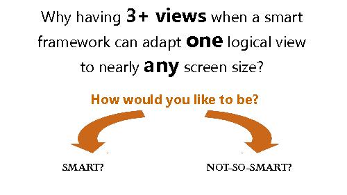
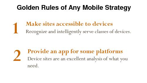
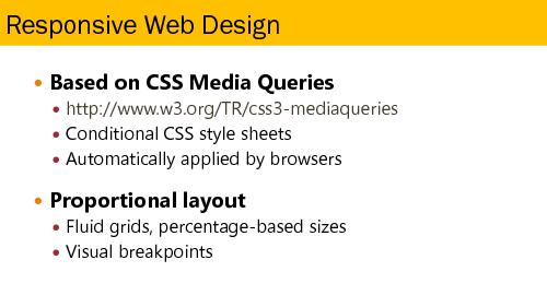
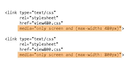
Any web site can be accessed with any sort of device, including laptops, smartphones, tablets, glasses, smart TVs. Obviously, your site must be responsive. But how you get to be responsive? Having separate web sites is a sure failure; you need a single web site that can offer different views. But what’s the ideal way of switching views? Is Responsive Web Design just enough? How does it really work? What are its hidden costs?
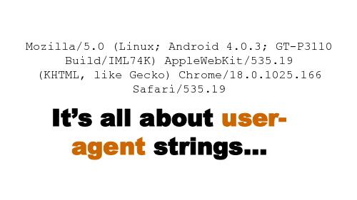
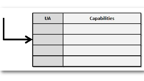
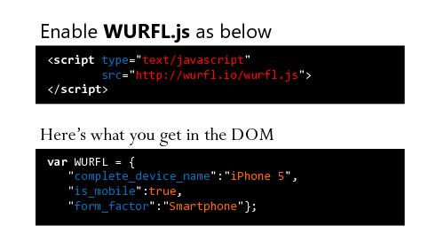
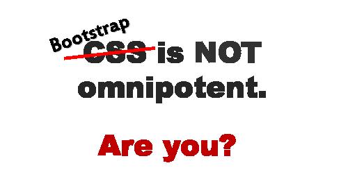
In the talk, Dino debunks some of the myths of Responsive Web Design and brings up the need of really different HTML views. The rest of the talk is built around a demo ASP.NET MVC application that uses a popular framework (WURFL, used by Google and Facebook to name a few) to switch views intelligently based on device detection.
Video
Slides
Links
Plays:61 Comments:0


